WGCNA 笔记第三弹
本代码借鉴了生信技能树的 WGCNA 教程以及 PlanTech 的 WGCNA 课程编写,转载请注明出处
# 1.WGCNA 安装
> install.packages ("BiocManager") | |
> BiocManager::install ("WGCNA") | |
> library (WGCNA) | |
载入需要的程辑包:dynamicTreeCut | |
载入需要的程辑包:fastcluster | |
载入程辑包:‘fastcluster’ | |
The following object is masked from ‘package:stats’: | |
hclust | |
载入程辑包:‘WGCNA’ | |
The following object is masked from ‘package:stats’: | |
cor |
# 2. 数据准备与读入
# 2.1 数据准备
需要两个数据
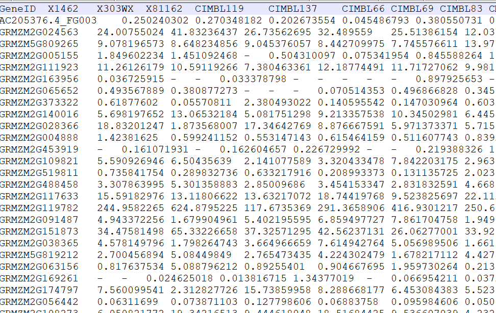
表达矩阵(All_fpkm.list)
![image-20200802142219001]()
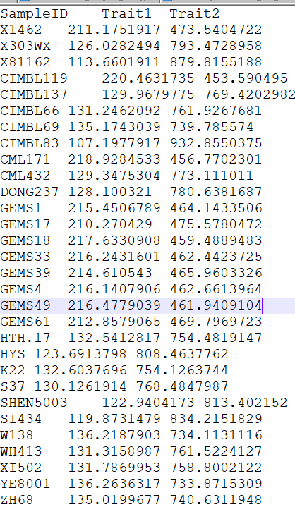
表型文件(pheno.txt), 需要注意表型文件分为两类,连续变量型与分类变量型.
# 2.2 数据读入
library (WGCNA) | |
library (reshape2) | |
library (stringr) | |
setwd ('D:/data/wgcna/Categorical') | |
options (stringsAsFactors = FALSE)# 在读入数据时,遇到字符串后,不要将其转换成因子,仍然保留为字符串格式 | |
enableWGCNAThreads ()# 打开多线程 | |
##====================step 1 : 数据读入 | |
RNAseq_voom <- fpkm | |
## 因为 WGCNA 针对的是基因进行聚类,而一般我们的聚类是针对样本用 hclust 即可,所以这个时候需要转置 | |
WGCNA_matrix = t (RNAseq_voom [order (apply (RNAseq_voom,1,mad), decreasing = T)[1:5000],]) | |
datExpr <- WGCNA_matrix ## top 5000 mad genes | |
# 明确样本数和基因 | |
nGenes = ncol (datExpr) | |
nSamples = nrow (datExpr) | |
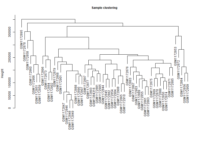
# 首先针对样本做个系统聚类 | |
datExpr_tree<-hclust (dist (datExpr), method = "average") | |
par (mar = c (0,5,2,0)) | |
png ("img/step1-sample-cluster.png",width = 800,height = 600) | |
plot (datExpr_tree, main = "Sample clustering", sub="", xlab="", cex.lab = 2, | |
cex.axis = 1, cex.main = 1,cex.lab=1) | |
dev.off () |
# 3. β 值估计
##====================step 2:β 值确定 ==== | |
datExpr [1:4,1:4] | |
powers = c (c (1:10), seq (from = 12, to=20, by=2)) | |
# 设置 beta 值的取值范围 | |
sft = pickSoftThreshold (datExpr, RsquaredCut = 0.9,powerVector = powers, verbose = 5) | |
# 设置网络构建参数选择范围,计算无尺度分布拓扑矩阵 | |
png ("img/step2-beta-value.png",width = 800,height = 600) | |
par (mfrow = c (1,2)); | |
cex1 = 0.9; | |
# Scale-free topology fit index as a function of the soft-thresholding power | |
plot (sft$fitIndices [,1], -sign (sft$fitIndices [,3])*sft$fitIndices [,2], | |
xlab="Soft Threshold (power)",ylab="Scale Free Topology Model Fit,signed R^2",type="n", | |
main = paste ("Scale independence")); | |
text (sft$fitIndices [,1], -sign (sft$fitIndices [,3])*sft$fitIndices [,2], | |
labels=powers,cex=cex1,col="red"); | |
# this line corresponds to using an R^2 cut-off of h | |
abline (h=0.90,col="red") | |
# Mean connectivity as a function of the soft-thresholding power | |
plot (sft$fitIndices [,1], sft$fitIndices [,5], | |
xlab="Soft Threshold (power)",ylab="Mean Connectivity", type="n", | |
main = paste ("Mean connectivity")) | |
text (sft$fitIndices [,1], sft$fitIndices [,5], labels=powers, cex=cex1,col="red") | |
dev.off () |
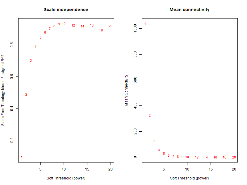
可以确定最佳 β 值为 6
# 4. 一步法构建共表达矩阵
最核心的一步,同时也是最耗费计算资源的一步
##====================step 3: 自动构建 WGCNA 模型 ================== | |
# 首先是一步法完成网络构建 | |
net = blockwiseModules ( | |
datExpr, | |
power = sft$powerEstimate, #软阈值,前面计算出来的 | |
maxBlockSize = 6000, #最大 block 大小,将所有基因放在一个 block 中 | |
TOMType = "unsigned", #选择 unsigned,使用标准 TOM 矩阵 | |
deepSplit = 2, minModuleSize = 30, #剪切树参数,deepSplit 取值 0-4 | |
mergeCutHeight = 0.25, # 模块合并参数,越大模块越少 | |
numericLabels = TRUE, # T 返回数字,F 返回颜色 | |
pamRespectsDendro = FALSE, | |
saveTOMs = TRUE, | |
saveTOMFileBase = "FPKM-TOM", | |
loadTOMs = TRUE, | |
verbose = 3 | |
) |
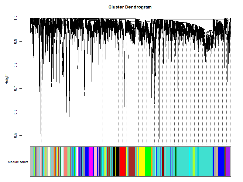
# 5. 模块可视化
##===============================step4: 模块可视化 ========================= | |
# Convert labels to colors for plotting | |
mergedColors = labels2colors (net$colors) | |
table (mergedColors) | |
moduleColors=mergedColors | |
# Plot the dendrogram and the module colors underneath | |
png ("img/step4-genes-modules.png",width = 800,height = 600) | |
plotDendroAndColors (net$dendrograms [[1]], mergedColors [net$blockGenes [[1]]], | |
"Module colors", | |
dendroLabels = FALSE, hang = 0.03, | |
addGuide = TRUE, guideHang = 0.05) | |
dev.off () | |
## assign all of the gene to their corresponding module | |
## hclust for the genes. | |
# 明确样本数和基因 | |
nGenes = ncol (datExpr) | |
nSamples = nrow (datExpr) | |
# 首先针对样本做个系统聚类 | |
datExpr_tree<-hclust (dist (datExpr), method = "average") | |
par (mar = c (0,5,2,0)) | |
plot (datExpr_tree, main = "Sample clustering", sub="", xlab="", cex.lab = 2, | |
cex.axis = 1, cex.main = 1,cex.lab=1) | |
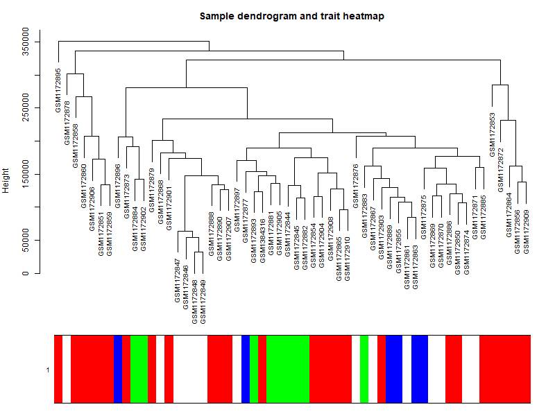
## 如果这个时候样本是有性状,或者临床表型的,可以加进去看看是否聚类合理 | |
# 针对前面构造的样品矩阵添加对应颜色 | |
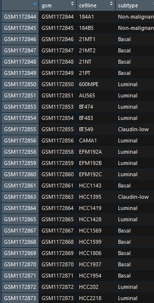
sample_colors <- numbers2colors (as.numeric (factor (datTraits$subtype)), | |
colors = c ("white","blue","red","green"),signed = FALSE) | |
## 这个给样品添加对应颜色的代码需要自行修改以适应自己的数据分析项目 | |
# sample_colors <- numbers2colors ( datTraits ,signed = FALSE) | |
## 如果样品有多种分类情况,而且 datTraits 里面都是分类信息,那么可以直接用上面代码,当然,这样给的颜色不明显,意义不大 | |
#10 个样品的系统聚类树及性状热图 | |
par (mar = c (1,4,3,1),cex=0.8) | |
png ("img/sample-subtype-cluster.png",width = 800,height = 600) | |
plotDendroAndColors (datExpr_tree, sample_colors, | |
groupLabels = colnames (sample), | |
cex.dendroLabels = 0.8, | |
marAll = c (1, 4, 3, 1), | |
cex.rowText = 0.01, | |
main = "Sample dendrogram and trait heatmap") | |
dev.off () |
可以看到模块用不同的颜色来标注,灰色模块是无法归类于任何模块的基因,在后续分析的时候不需要考虑
# 6. 模块与性状的关系
##===============================step5: 模块与性状的关系 =================== | |
table (datTraits$subtype) | |
nGenes = ncol (datExpr) | |
nSamples = nrow (datExpr) | |
design=model.matrix (~0+ datTraits$subtype) | |
colnames (design)=levels (datTraits$subtype) | |
moduleColors <- labels2colors (net$colors) | |
# Recalculate MEs with color labels | |
MEs0 = moduleEigengenes (datExpr, moduleColors)$eigengenes | |
MEs = orderMEs (MEs0); ## 不同颜色的模块的 ME 值矩 (样本 vs 模块) | |
# 输出每个基因所在的模块,以及与该模块的 KME 值 | |
file.remove ('All_Gene_KME.txt') | |
for (module in substring (colnames (MEs),3)){ | |
if (module == "grey") next | |
ME=as.data.frame (MEs [,paste ("ME",module,sep="")]) | |
colnames (ME)=module | |
datModExpr=datExpr [,moduleColors==module] | |
datKME = signedKME (datModExpr, ME) | |
datKME=cbind (datKME,rep (module,length (datKME))) | |
write.table (datKME,quote = F,row.names = T,append = T,file = "All_Gene_KME.txt",col.names = F) | |
} | |
moduleTraitCor = cor (MEs, design , use = "p"); | |
moduleTraitPvalue = corPvalueStudent (moduleTraitCor, nSamples) | |
sizeGrWindow (10,6) | |
# Will display correlations and their p-values | |
textMatrix = paste (signif (moduleTraitCor, 2), "\n (", | |
signif (moduleTraitPvalue, 1), ")", sep = ""); | |
dim (textMatrix) = dim (moduleTraitCor) | |
png ("img/step5-Module-trait-relationships.png",width = 800,height = 600) | |
par (mar = c (6, 8.5, 3, 3)); | |
# Display the correlation values within a heatmap plot | |
labeledHeatmap (Matrix = moduleTraitCor, | |
xLabels = colnames (design), | |
yLabels = names (MEs), | |
ySymbols = names (MEs), | |
colorLabels = FALSE, | |
colors = blueWhiteRed (50), | |
textMatrix = textMatrix, | |
setStdMargins = FALSE, | |
cex.text = 0.5, | |
zlim = c (-1,1), | |
main = paste ("Module-trait relationships")) | |
dev.off () | |
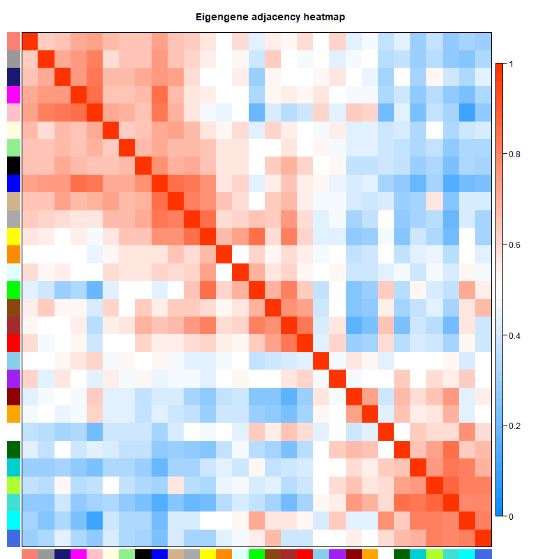
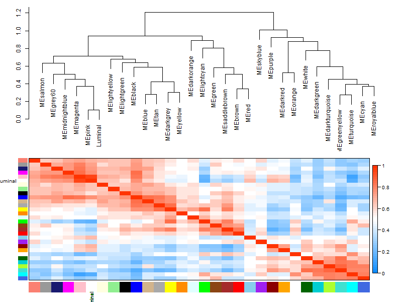
# 绘制两两模块间的邻接矩阵 | |
png ("img/wgcna.adjacency.heatmap.pdf",height = 800,width = 600) | |
plotEigengeneNetworks (MEs, "Eigengene adjacency heatmap",plotDendrograms = F, | |
marDendro = c (4,4,2,4)) | |
dev.off () |
可以看到不同的模块与不同的性状是有不同的相关性的,在后续分析的时候我们可以选择感兴趣的模块进行分析。

两两模块之间的邻接矩阵,主要看不同模块之间的相关性
# 7. 选择感兴趣的模块进行分析
##===============================step 6:感兴趣性状的模块的具体基因分析 ===== | |
# 查看第五步出图:step5-Module-trait-relationships.png | |
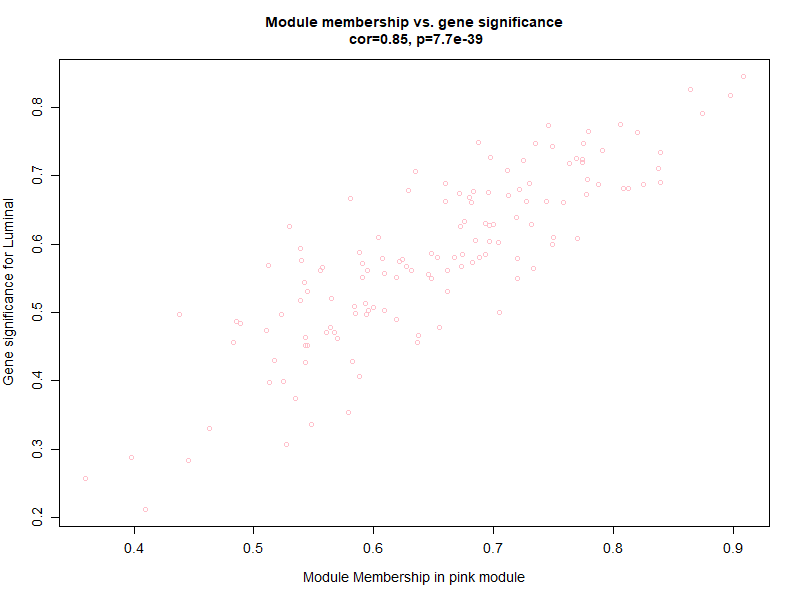
# 发现跟 Luminal 亚型 最相关的是 pink 模块 | |
# 所以接下来就分析这两个 | |
Luminal = as.data.frame (design [,3]) | |
names (Luminal) = "Luminal" | |
module = "pink" | |
# names (colors) of the modules | |
modNames = substring (names (MEs), 3) | |
geneModuleMembership = as.data.frame (cor (datExpr, MEs, use = "p")) | |
## 算出每个模块跟基因的皮尔森相关系数矩阵 | |
## MEs 是每个模块在每个样本里面的 | |
## datExpr 是每个基因在每个样本的表达量 | |
MMPvalue = as.data.frame (corPvalueStudent (as.matrix (geneModuleMembership), nSamples)) | |
names (geneModuleMembership) = paste ("MM", modNames, sep="") | |
names (MMPvalue) = paste ("p.MM", modNames, sep="") | |
geneModuleMembership [1:4,1:4] | |
## 只有连续型性状才能只有计算 | |
## 这里把是否属 Luminal 表型这个变量 0,1 进行数值化 | |
Luminal = as.data.frame (design [,3]) | |
names (Luminal) = "Luminal" | |
geneTraitSignificance = as.data.frame (cor (datExpr, Luminal, use = "p")) | |
GSPvalue = as.data.frame (corPvalueStudent (as.matrix (geneTraitSignificance), nSamples)) | |
names (geneTraitSignificance) = paste ("GS.", names (Luminal), sep="") | |
names (GSPvalue) = paste ("p.GS.", names (Luminal), sep="") | |
module = "pink" | |
column = match (module, modNames) | |
moduleGenes = moduleColors==module | |
png ("step6-Module_membership-gene_significance.png",width = 800,height = 600) | |
#sizeGrWindow (7, 7) | |
par (mfrow = c (1,1)) | |
verboseScatterplot (abs (geneModuleMembership [moduleGenes, column]), | |
abs (geneTraitSignificance [moduleGenes, 1]), | |
xlab = paste ("Module Membership in", module, "module"), | |
ylab = "Gene significance for Luminal", | |
main = paste ("Module membership vs. gene significance\n"), | |
cex.main = 1.2, cex.lab = 1.2, cex.axis = 1.2, col =module) | |
dev.off () |
由于是分类变量,只能按照 0 至 1 量化,可以看出模块内的基因与表型有很好的线性关系
然后再绘制性状与模块的关系
# Recalculate module eigengenes | |
MEs = moduleEigengenes (datExpr, moduleColors)$eigengenes | |
## 只有连续型性状才能只有计算 | |
## 这里把是否属 Luminal 表型这个变量 0,1 进行数值化 | |
Luminal = as.data.frame (design [,3]); | |
names (Luminal) = "Luminal" | |
# Add the weight to existing module eigengenes | |
MET = orderMEs (cbind (MEs, Luminal)) | |
# Plot the relationships among the eigengenes and the trait | |
sizeGrWindow (5,7.5); | |
par (cex = 0.9) | |
png ("img/step6-Eigengene-dendrogram.png",width = 800,height = 600) | |
plotEigengeneNetworks (MET, "", marDendro = c (0,4,1,2), marHeatmap = c (3,4,1,2), cex.lab = 0.8, xLabelsAngle | |
= 90) | |
dev.off () | |
# Plot the dendrogram | |
sizeGrWindow (6,6); | |
par (cex = 1.0) | |
## 模块的进化树 | |
png ("img/step6-Eigengene-dendrogram-hclust.png",width = 800,height = 600) | |
plotEigengeneNetworks (MET, "Eigengene dendrogram", marDendro = c (0,4,2,0), | |
plotHeatmaps = FALSE) | |
dev.off () | |
# Plot the heatmap matrix (note: this plot will overwrite the dendrogram plot) | |
par (cex = 1.0) | |
## 性状与模块热 | |
png ("img/step6-Eigengene-adjacency-heatmap.png",width = 800,height = 600) | |
plotEigengeneNetworks (MET, "Eigengene adjacency heatmap", marHeatmap = c (3,4,2,2), | |
plotDendrograms = FALSE, xLabelsAngle = 90) | |
dev.off ()# Recalculate module eigengenes | |
MEs = moduleEigengenes (datExpr, moduleColors)$eigengenes | |
## 只有连续型性状才能只有计算 | |
## 这里把是否属 Luminal 表型这个变量 0,1 进行数值化 | |
Luminal = as.data.frame (design [,3]); | |
names (Luminal) = "Luminal" | |
# Add the weight to existing module eigengenes | |
MET = orderMEs (cbind (MEs, Luminal)) | |
# Plot the relationships among the eigengenes and the trait | |
sizeGrWindow (5,7.5); | |
par (cex = 0.9) | |
png ("img/step6-Eigengene-dendrogram.png",width = 800,height = 600) | |
plotEigengeneNetworks (MET, "", marDendro = c (0,4,1,2), marHeatmap = c (3,4,1,2), cex.lab = 0.8, xLabelsAngle | |
= 90) | |
dev.off () | |
# Plot the dendrogram | |
sizeGrWindow (6,6); | |
par (cex = 1.0) | |
## 模块的进化树 | |
png ("img/step6-Eigengene-dendrogram-hclust.png",width = 800,height = 600) | |
plotEigengeneNetworks (MET, "Eigengene dendrogram", marDendro = c (0,4,2,0), | |
plotHeatmaps = FALSE) | |
dev.off () | |
# Plot the heatmap matrix (note: this plot will overwrite the dendrogram plot) | |
par (cex = 1.0) | |
## 性状与模块热 | |
png ("img/step6-Eigengene-adjacency-heatmap.png",width = 800,height = 600) | |
plotEigengeneNetworks (MET, "Eigengene adjacency heatmap", marHeatmap = c (3,4,2,2), | |
plotDendrograms = FALSE, xLabelsAngle = 90) | |
dev.off () |
# 8. 网络的可视化
# 主要是可视化 TOM 矩阵,WGCNA 的标准配图 | |
# 然后可视化不同 模块 的相关性 热图 | |
# 不同模块的层次聚类图 | |
# 还有模块诊断,主要是 intramodular connectivity | |
nGenes = ncol (datExpr) | |
nSamples = nrow (datExpr) | |
geneTree = net$dendrograms [[1]]; | |
dissTOM = 1-TOMsimilarityFromExpr (datExpr, power = 6); | |
plotTOM = dissTOM^7; | |
diag (plotTOM) = NA; | |
#TOMplot (plotTOM, geneTree, moduleColors, main = "Network heatmap plot, all genes") | |
nSelect = 400 | |
# For reproducibility, we set the random seed | |
set.seed (10); | |
select = sample (nGenes, size = nSelect); | |
selectTOM = dissTOM [select, select]; | |
# There’s no simple way of restricting a clustering tree to a subset of genes, so we must re-cluster. | |
selectTree = hclust (as.dist (selectTOM), method = "average") | |
selectColors = moduleColors [select]; | |
# Open a graphical window | |
sizeGrWindow (9,9) | |
# Taking the dissimilarity to a power, say 10, makes the plot more informative by effectively changing | |
# the color palette; setting the diagonal to NA also improves the clarity of the plot | |
plotDiss = selectTOM^7; | |
diag (plotDiss) = NA; | |
png ("img/step7-Network-heatmap.png",width = 800,height = 600) | |
TOMplot (plotDiss, selectTree, selectColors, main = "Network heatmap plot, selected genes") | |
dev.off () |
不知道为啥,这张图有点奇怪

# 9. 模块的导出
##===============================step 8:模块导出 ========= | |
# 导出模块内部基因的连接关系,进入其它可视化软件 | |
# 比如 cytoscape 软件等等。 | |
# Recalculate topological overlap | |
TOM = TOMsimilarityFromExpr (datExpr, power = 6); | |
# Select module | |
module = "pink"; | |
# Select module probes | |
probes = colnames (datExpr) ## 我们例子里面的 probe 就是基因 | |
inModule = (moduleColors==module) | |
modProbes = probes [inModule] | |
## 也是提取指定模块的基因名 | |
# Select the corresponding Topological Overlap | |
modTOM = TOM [inModule, inModule] | |
dimnames (modTOM) = list (modProbes, modProbes) | |
## 模块对应的基因关系矩 | |
cyt = exportNetworkToCytoscape ( | |
modTOM, | |
edgeFile = paste ("CytoscapeInput-edges-", paste (module, collapse="-"), ".txt", sep=""), | |
nodeFile = paste ("CytoscapeInput-nodes-", paste (module, collapse="-"), ".txt", sep=""), | |
weighted = TRUE, | |
threshold = 0.02, | |
nodeNames = modProbes, | |
nodeAttr = moduleColors [inModule] | |
) |
模块导出后可以用 cytoscape 构建网络,后面的教程会教大家利用这个文件构建网络图
# 后记
本次 WGCNA 的代码结合了生信技能树和 PlantTech 的 WGCNA 教程,原始数据也来自这两个教程,我将代码和原始数据上传到自己的 github 中,其中 PlantTech 课程是收费课程,我已将其下载,大家有需要可以去百度云下载(提取码:es41)
视频压缩包解压密码是我博客 about 界面下的一行小字(出自《蒲公英女孩》,标点是英文),如果链接炸了去博客找我联系方式。